
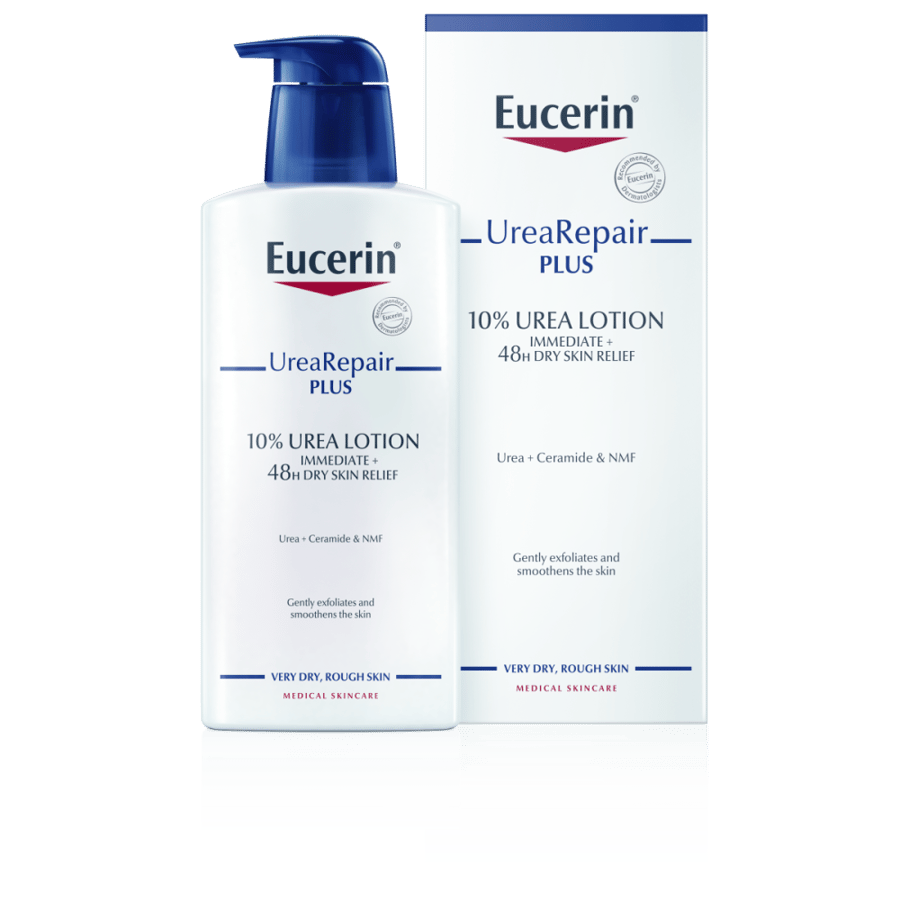

يوسرين لوشن للعناية الكاملة بالبشرة الجافة 10% يوريا 400 مل
119.95ر.س
184ر.س-35%وصف المنتج
<style> /* start banners */ .ban img:first-of-type { margin-top: 2%; } .ban img { display: block; margin: 0 auto 2%; width: 90%; } @media screen and (max-width: 700px) { .ban img { width: 100%; } } /* end banners */ /* 2 image in one start */ .combine img { margin: 0 auto; display: block; width: 90%; } .combine img:last-of-type { margin-bottom: 2%; } @media screen and (max-width: 700px) { .combine img { width: 100%; } } /* 2 image in one end */ /* start product label */ :root { --bioderma: #a50a2b; /* sensibio */ } .grico { display: flex; justify-content: center; align-items: center; margin: 0 auto; width: 80%; } .gridz { margin: 0 auto; display: grid; grid-template-areas: "on tw tw sv" "fr tw tw fv" 'sx tw tw et'; justify-content: flex-start; align-items: center; row-gap: 2px; width: auto; } .one { grid-area: on; } .two { grid-area: tw; background-color: transparent; position: relative; } .four { grid-area: fr; } .fivez { grid-area: fv; } .six { grid-area: sx; } .seven { grid-area: sv; } .eight { grid-area: et; } .two img { display: block; width: 100%; } .gridz>div p:first-of-type { font-weight: bold; margin: 1rem 0; } .one::before, .four::before, .six::before { content: ""; position: absolute; top: 49%; right: -.1rem; width: .5rem; height: .5rem; border-radius: 100px; display: block; background-color: var(--bioderma) } .five::before { content: ""; position: absolute; top: 49%; left: -.1rem; width: .5rem; height: .5rem; border-radius: 100px; display: block; background-color: var(--bioderma); } .one, .four, .six { border-top: 2px solid var(--bioderma); position: relative; text-indent: 1em; } .five { border-top: 2px solid var(--bioderma); position: relative; text-align: left; } .five p::after { display: inline-block; content: ""; width: 1em; } .borderLeft { border-left: 2px solid var(--bioderma); position: absolute; top: 0; bottom: 0; height: 50%; } .borderRight { border-left: 2px solid var(--bioderma); position: absolute; top: 0; left: 0; height: 50%; } .five .borderLeft { opacity: 0; } .lion { color: var(--bioderma); font-weight: bold; margin-left: 1em; } .bigimage { display: block; } .smallimage { display: none !important } @media screen and (max-width: 700px) { .grico { display: block; overflow: hidden; width: 100%; } .gridz { grid-template-areas: "on tw " "fr tw " "fv tw " 'sx tw '; row-gap: 15px; justify-content: flex-start; align-items: center; } .five::before { right: -.1rem; } .five { text-indent: 1em; padding-left: 0; text-align: right; } .five .borderLeft { opacity: 1; } .five .borderRight { display: none; } .one { width: 60vw; } .two { width: 40vw; } } @media screen and (max-width: 490px) { .bigimage { display: none !important } .smallimage { display: block !important } } /* end product label */ /* start video */ #video { position: relative; padding-bottom: 56.25%; /* 16:9 */ height: 0; margin-bottom: 2%; } #video iframe { position: absolute; top: 0; left: 0; width: 100%; height: 100%; } /* end video */ /* start image collection */ .imagegroup { display: flex; justify-content: space-evenly; align-items: center; margin-bottom: 3%; } .imagegroup img { width: 30%; display: block; margin: 2% auto; } @media screen and (max-width: 700px) { .imagegroup { flex-direction: column; } .imagegroup img { width: 100%; margin: 2% auto; } } /* end image collection */ /* start benfits */ .benf { display: flex; flex-wrap: wrap; padding: 15px; justify-content: space-evenly; } .features { flex-basis: 30%; } .half { flex-basis: 48%; } .imgcontainer { max-height: 130px; overflow: hidden; } .imgcontainer img{ transform: translateY(-28%); } .features img { display: block; margin: 3% auto; width: 100%; } .features p:first-of-type { font-weight: bold; text-align: center; margin-top: 1rem; } @media screen and (max-width: 700px) { .benf { flex-direction: column; padding: 0; } } /* end benfits */ /* start how */ .how { display: flex; justify-content: space-evenly; align-items: center; flex-wrap: wrap; } .how>div { width: 48%; } .how img { display: block; margin: 0 auto; width: 100%; } .use { line-height: 2em; } .use ul li { padding: 5px; vertical-align: middle; } .im { display: flex; } .im img { align-self: center; } @media screen and (max-width: 700px) { .how>div { width: 100%; } .use { order: 2; } .im { order: 1 } .im img { width: 100%; margin: 3% auto; } .use { line-height: normal; } .use ul li { padding: 5px; vertical-align: middle; } } /* start how */ /* Beauty Care Routine */ .Care { display: flex; flex-wrap: wrap; justify-content: space-around; align-items: center; } .Tips { flex-basis: 25%; padding: 0px; text-align: center; } .btn2 { color: #843090; font-size: large; font-weight: bold; box-shadow: 0px 2px 2px 2px; min-width: 125px; padding: 20px 0px; text-decoration: underline; } .btn2 { animation-name: line; animation-duration: 1.5s; animation-iteration-count: infinite; transition: ease; animation-fill-mode: both; } @keyframes line { 0% { text-decoration: underline; } 100% { text-decoration: none; } } .arrowz { border: solid #843090; border-width: 0 3px 3px 0; display: inline-block; padding: 3px; } .leftz { transform: rotate(135deg); -webkit-transform: rotate(135deg); margin-left: 5px; } .BeautyCare { position: relative; } .BeautyCare-block { position: absolute; bottom: 44%; right: 5%; color: white; padding: 0px; } .Choose { color: white; font-size: 4vw; text-align: right; } @media screen and (max-width: 700px) { .Tips { flex-basis: 50%; } .BeautyCare { position: relative; } .BeautyCare-block { position: absolute; bottom: 33%; right: 5%; color: white; padding: 0px; } .Choose { color: white; font-size: 5vw; text-align: right; } } /* end tips */ /* Features Styling */ .rowz { display: flex; flex-wrap: wrap; justify-content: space-around; } .Features { flex-basis: 16%; padding: 10px 5px; text-align: center; text-transform: capitalize; } .Features img { min-width: 75.34px; display: block; width: 100%; margin: 0 auto ; } .FeaturesHeaders { color: #843090; font-weight: bold; } @media screen and (max-width: 700px) { .Features { flex-basis: 32%; } } .mainimge { position: relative; background-color: aliceblue; margin-bottom: 5%; } .imgeover { position: absolute; top: 80%; font-size: 3rem; background-color: #bbe7d4; width: 100%; text-align: center; z-index: 2; padding: 10px; font-weight: bold; } .isidcont { margin-bottom: 20%; position: relative; z-index: 1; } .subimage { display: flex; padding: 15px; justify-content: space-between; margin-bottom: 15%; } .subimage>div { flex-basis: 48%; } #sub1 p:first-of-type::before { content: "\A"; border-style: solid; border-width: 30px 30px 30px 0; border-color: transparent #a50a2b transparent transparent; position: absolute; right: -20px; top: -15px; } #sub1 p { font-size: 3rem; position: relative; padding-right: 20px; top: 10%; right: 5%; text-transform: uppercase; z-index: 6; } #sub2 { display: flex; justify-content: center; align-items: center; } #sub2 img { display: block; width: 50%; margin: 0 auto; z-index: 5; position: relative; } .guideimg img { display: block; margin: 0 auto; border: 5px black solid; } .import { font-weight: bold; color:red } @media screen and (max-width: 999px) { #sub1 p { font-size: 2.5rem; } @media screen and (max-width: 700px) { #sub1 p { font-size: 5vw; } </style> <style> :root { --bioderma: #a50a2b; } .grico { width: 50%; } .gridz { grid-template-areas: "on tw ." "fr tw fv" 'sx tw .'; row-gap: 15px; justify-content: flex-start; align-items: center; } .five { grid-area: fv; text-align: center; } .mainimge { background: url(https://www.nahdionline.com/media/content/eucerin/shutterstock_277278965.jpg?rand=1624958270); background-size: cover; } .imgeover { background: linear-gradient(to right, transparent, #e4ecfc, #cadcff); } .use ul li { padding: 0px; } @media screen and (max-width: 992px) { .grico { width: 70%; } } @media screen and (max-width: 700px) { .grico { display: block; overflow: hidden; width: 100%; } .gridz { padding: 10px; grid-template-areas: "on tw " "fr tw " "fv tw " 'sx tw '; width: auto; } .five { padding-left: 0; text-align: right; } .gridz>div p:first-of-type { margin-top: 1em; } .use ul li { padding: 5px; } .one { width:60vw; } .two { width:40vw; } #sub2 img { width: 80%; } } </style> 

 --> <!-- --> <!-- end video --> <!--
  --> <!--

 -->
--> 


 <!-- staert benfits --> <!-- how to use -->
  <!-- tips -->


وصف المنتج:
- يمنح اللوشن بشرة الجسم الجافة جدًا والخشنة العناية اليومية التي تحتاجها.
- يتم ترطيب البشرة بشكل مكثف وتبدو ناعمة ونضرة مرة أخرى.
لوشن اليوريا من يوسيرين
للبشرة الجافة جدًا والخشنة
مثبت سريريا
راحة فورية وترطيب مكثف طويل الأمد
مزيج فريد من المكونات
اليوريا + سيراميد و NMFs
تركيبة آمنة
المكوناتمميزات المنتج:
خالٍ من العطر
لا يسد المسام
مناسب للجسم
سريع الامتصاص
غير دهني
فوائد المنتج:
- أثبتت التركيبة سريريًا وجلديًا أنها توفر راحة فورية وترطيبًا مكثفًا طويل الأمد ، مما يؤخر الجفاف والخشونة لمدة تصل إلى 48 ساعة.
- هذا المستحضر مناسب للبشرة الناضجة والمصابين بمرض السكري والصدفية والتقرن الشعري.
- يمكن استخدامه أيضًا كعناية إضافية.
- يوفر المستحضر راحة فورية + 48 ساعة للبشرة الجافة جدًا والخشنة حتى تشعر بالنعومة والنضارة مرة أخرى.
- هذا المستحضر مناسب لجميع بشرة البالغين.
ارشادات الاستخدام:
- دلكي المستحضر بلطف على بشرتك حتى يتم امتصاصه بالكامل
- تقدم كلما دعت الحاجة
كيفية الاستخدام
دلكي المستحضر بلطف على بشرتك حتى يتم امتصاصه بالكامل
دواعي الاستخدام:
- لديك بشرة جافة وخشنة على جسمك
- لديك جفاف ، صدفية أو داء السكري
المكونات:
- عوامل الترطيب الطبيعية (NMF)
- سيراميد 3
- اليوريا
- يعمل السيراميد الموجود في التركيبة على إصلاح حاجز البشرة وتقليل فقدان الترطيب.
- ترتبط اليوريا وعوامل الترطيب الطبيعية الأخرى بالماء ، مما يمنح راحة فورية للجفاف والخشونة ويوفر ترطيبًا مكثفًا لمدة 48 ساعة.
إختاري روتين العناية ببشرتك
